Background
Expedia Group branded customer care support agents (located throughout Philippines, San Salvador, Egypt, North America) face the challenge of having to use different tools and applications (GDS, Classic Voyager, Voyager Flights, Eureka, Brand Site for Agents, etc.) to exchange customer flight bookings. On the Voyager Flights tool, agents have to manually determine penalty, change fee policy, and booking class rules which if done inaccurately lead to airline debit memos that adversely impact the business.
Incomprehensible system errors due to issues in downstream services and the inability to display information due to out of sync booking information when backend systems pull from different data stores also add to the pain points agents experience. When the agents don't know what their next step should be to resolve their customer's problems it leads to dissatisfaction. Tier 2 and Tier 3 agents have to memorize 15+ key commands for the different GDS systems they use to service flight bookings. There existed an opportunity to make a more user friendly interface that could quickly give the agents the information they need and reduce their average handling time.
Design Process
My Role
As the main designer on the project, I worked with the business owner, creative director, product managers, program managers, content strategist, testers, developers, service & delivery, and learning development teams to alleviate the customer pain points and improve the experience faced by the phone agents on complex flight exchange cases. I was a mentor to the designer working on customer self-service flight change. I drafted a design schedule for both our areas and reviewed the other designer's work. I designed around the constraints of an existing visual and interaction style guide and took into consideration the agent's current work flow for how they exchange flights in their current tool. I looked at their mental model for how other products were exchanged in the tool that I'd be building upon. I made design prioritization tradeoffs due to technical and resource limitations and followed design principles around simplicity, focus, clarity and efficiency in the user experience.
Customer Needs
• Improve user experience and increase user confidence. Make it easy and efficient for call center agents to service US and Canadian point of sale flight booking exchanges.
• Improve CSAT (customer satisfaction) for high volume and high effort calls.
• Reduce the customer effort required for 31% of flight exchanges
Business Goals
• Reduce operating costs and optimize the business by increasing the customer's ability to self-service.
• Reduce AHT (average handling time) and agent error costs.
• Reduce call propensity by at least 1% (target: 20%).
Understanding the user: Call Center Agents
When I interviewed and observed call agents at the different customer care centers, I saw they were on the phone with the customer an average of 5 to 15 minutes for simple cases and 30 minutes for complex ones. And, in extreme cases, like those due to weather related schedule changes, an agent could spend 1.5 hours on the phone with the customer and airlines. Customer call time increases for cases that need higher tier level agents/supervisors access and approval.


Call center agents are able to exchange flights for customers.

Call center agents are able to exchange flights for customers.
Design Planning
• Participated in Project Inceptions to gain a shared vision of business priorities, strategy and project scope from Product Management, Line of Business, Development, and additional cross-functional teams. Met with Learning & Development to understand agent workflows and flight exchange and cancel policies and Content Strategists on the Eureka Knowledge Base Tool that agents depend on.
• Drafted and presented design schedule to product management and development/test teams based on dev milestones and the scope of the project.
• Participated in working sessions with PM/DEV/TEST to discuss project scope and technical constraints. Group white boarding sessions to agree on user experience and user flow with shared understanding of data model, and business requirements.
• Created an html design index and Confluence page for the project that displayed the task flow diagrams and links to prototype, mockups deliverables, and redlines/annotations.
Understanding the problem space
Met with my PM/Business owner to gain more background on the flight business and strategy on why the project was important. I learned about the tools the agents use and training they go through.


Research
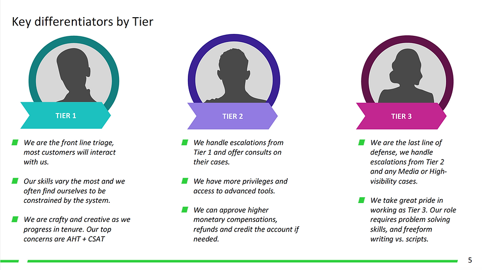
• Observed and interviewed call center agents to understand their workflow and escalation process for the different agent types: Tier 1, Tier 2, and Tier 3 (Complex Air Agents).
• Consulted with subject matter expert from the service delivery team and the line of business product managers on knowledge collected from past survey results and call center agent visits. The goal was to understand the issues that had the biggest impact on the business and the user experience pain points.
• Competitive analysis and heuristic evaluation of airline websites (United, Alaska, etc.).
• Task analysis and evaluation of the current user experience (Voyager Flights tool) that was being used to exchange, cancel, and void flights by Tier 1 agents in US/CANADA.
• Researched how the GDS is being used by Tier 2 agents and Complex Air agents.
User Scenarios
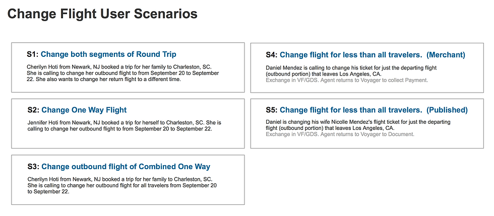
Identified key scenarios and use cases. Created wireframe screens in Sketch. Built out multiple prototypes in Axure for usability testing.


User Task Flow Diagram
I delivered scenario flows for the different use cases and handed off design for the following screen deliverables: Select Flights/Travelers, Search, Search Results, Review, Confirmation, and confirmation email template. I contributed to the style guide by introducing a new layout pattern on the Review screen for displaying the amount due for a flight exchange.
For the customer self-service portion, I delivered on the review, checkout, and confirmation user experience and ensured the end to end self-service flow worked for responsive web.


Design Deliverables
Created an html index page for the designs. Planned for a design schedule that took into consideration the multiple design iterations with usability testing as well as feedback from reviews with business owners.


Drafted a schedule and worked with dev team on alignment of the design deliverable dates would work with the dev milestones.

Drafted a schedule and worked with dev team on alignment of the design deliverable dates would work with the dev milestones.
Focus Group Session
Agents prioritized most common used tasks they use in Voyager Flights.


Background
Expedia Group branded customer care support agents (located throughout Philippines, San Salvador, Egypt, North America) face the challenge of having to use different tools and applications (GDS, Classic Voyager, Voyager Flights, Eureka, Brand Site for Agents, etc.) to exchange customer flight bookings. On the Voyager Flights tool, agents have to manually determine penalty, change fee policy, and booking class rules which if done inaccurately lead to airline debit memos that adversely impact the business.
Incomprehensible system errors due to issues in downstream services and the inability to display information due to out of sync booking information when backend systems pull from different data stores also add to the pain points agents experience. When the agents don't know what their next step should be to resolve their customer's problems it leads to dissatisfaction. Tier 2 and Tier 3 agents have to memorize 15+ key commands for the different GDS systems they use to service flight bookings. There existed an opportunity to make a more user friendly interface that could quickly give the agents the information they need and reduce their average handling time.
Design Process

AT&T Setup & Mobile Transfer 2.2
AT&T Setup & Transfer is the onboarding setup experience for AT&T customers onto Android devices.
AT&T Mobile Transfer enables users to backup and restore their data from an old phone to a new one.

Goals
Customers in AT&T stores were struggling to get onboarded. AT&T Setup & Transfer should make it easy for both existing and new AT&T customers to quickly access photos, voicemail, address book, and set up AT&T accounts, and services, on their device. The goal is to get people through the AT&T setup experience and have a phone that is customized to their needs. Worked with two program managers, creative director, designers, copy writers, user research, and developers to align on the project vision, scope, and deliverables. Deliverables included final mockups, redlines, styleguide, and source vector files. Deliverables handed to third party developer. Reviewed builds and communicated bugs for final polish. Cross-team partnerships with representatives involved in branding and accessibility reviews.
Final design

Challenges
Distinguishing the AT&T setup from the Google setup, yet making sure the flow did not feel disjointed. A balance between retaining the AT&T brand yet feel in harmony with the lollipop material design.
Background Context
AT&T had a 40% take rate, but as it moved into the second position behind Google, there was worry that the adoption rate may go down. The ask was to make the AT&T setup flow more visually appealing and engaging. The setup flow goes Google setup, then AT&T, and then any OEM (device manufacturer) setup.
The effort was to streamline the two existing AT&T apps (AT&T Ready2Go and Mobile Transfer) into a single app. Reduce # of apps the business has to maintain and respond to customer feedback that there is a lot of bloatware that comes preloaded on their devices.


Project Scope
Improve user experience: UX flows, user interface design and visual styleguide and interaction design improvements.
Design Definition
In the past, the AT&T Ready2Go flow preceded the Google flow in migrating content. In this update to the experience, Google setup (migrating apps, connecting with google account) comes before the AT&T setup (AT&T apps, social accounts, photos/videos in Locker and contacts in their AT&T Address Book). As such, the experience needed to leverage the Google setup and not feel duplicative or abrupt. Customer must find value to spending time onboarding AT&T services.
-
Preliminary investigations for the App Select screen explored the concept of bundling AT&T apps and services by default but with easy access to edit their preloaded apps and services list.
-
Preliminary approaches explored whether the AT&T flow should be distinctly different from the Google flow knowing that an OEM flow would precede it as well.
Early visual exploration: Lifestyle Approach
How might a distinct look to AT&T setup increase adoption success rate of AT&T services?


Early visual exploration: Emotive Approach
How might we increase adoption success rate of AT&T services through AT&T setup ?

Mobile Transfer Mood Board
AT&T Setup & Transfer Mood Board
Design iterations and approach:


Flexibility - Customer in Control
AT&T Mobile Transfer is a restore experience that is integrated in the AT&T Setup & Transfer AND can also be accessed as a standalone app experience that enables users to backup and restore content from an old phone to a new one.
AT&T Mobile Transfer
Preliminary heuristic design evaluation was done on the two old flows to identify areas that could be improved. Initial explorations involved design recommendations to Mobile Transfer flow and updating the Ready2Go user interfaces to feel more connected, consistent, and modern. Key screens were looked at. Improved information design was explored. Mobile Transfer experience improved and launched.

Design Scoping: Focus efforts on updates to key top level screens of mobile transfer and setup flow. Sub-level page user interfaces were de-prioritized due to budget constraints. Any ui adjustments that were made based on customer feedback need.

Design Assessment

Wireframe Key User Scenarios

Design Scoping: Focus efforts on updates to key top level screens of mobile transfer and setup flow. Sub-level page user interfaces were de-prioritized due to budget constraints. Any ui adjustments that were made based on customer feedback need.

Improved experience outcomes
Streamlined flow, updated and aligned visual styles, improved content text, and interaction affordances for clarity and focus in next steps, selection, and status.


Future Vision
The App Select screen explored the concept of bundling AT&T apps and services by default but with easy access to edit their preloaded apps and services list.

Early Flow Exploration: Bundling and acknowledging a set of services.

Design evolved merging ideas from 2nd row third option that displayed icon on top right and first row with white icon.

Early explorations

Early Flow Exploration: Bundling and acknowledging a set of services.